Yesterday's To Do's to buy foam core board and blog about photo editing had to get put on hold due to a nasty headache. Sadly, today's not much better, and I've missed out on a gorgeous sunny day to try retaking some of my older pictures. Best laid plans, and all that.
There's a lot of photo editing software out there. I've tried some of the higher-end ones in the past, including Photoshop, and found that for me they were incredibly non-intuitive, and I spent more time reading instructions and making notes on how to find things than I did actually editing pictures. For the last few years I've been using
Paint.NET, which has the added benefit of being free! I usually subscribe to an 80/20 rule on things like this-- if I can get 80% of the benefit for 20% (or less) of the cost and effort, then that last 20% of benefit just isn't worth it to me.

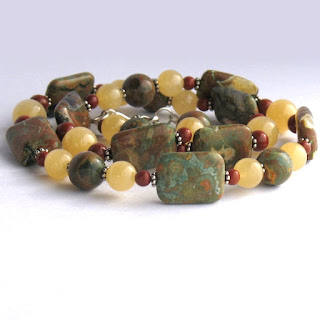
The final photo up at the top of the post started out as the picture to the left, here. You can see all the seams between pieces of card stock that I was talking about in the
last post. I took this when it was partly sunny out, but the picture's still pretty dim.
Photos for use on Etsy are supposed to be square, at 1000x1000 pixels. Cropping the shot got rid of most of the seams, but there was one up at the top right that I couldn't cut out without either losing the sides of the necklace or having it end up too far out of the center of the picture. Luckily, it's fixable. After doing the color correction below, I used the "Magic Wand" tool, at about 30% tolerance, which selected the top inch or so of the picture. Then it was easy to use the "Paint Bucket" to fill the entire area with an even color. Hey, presto, the seams were gone!

Learning about editing levels made my life so much easier. By using the "Color Picker" tool, you can find out the numeric RGB color values for any given spot on the picture. I select the brightest area of the background, and because I used white card stock, this should be white in the final photo. Adjustments > Levels will bring up the box you see in the center of the screencap there. Going into each color individually and correcting the number for all three to 255 will turn those areas white, and brighten up the entire picture without washing it out. Because I'm trying to give my customers an accurate portrait of the piece they'll be buying, I don't do much else to the picture. Depending on how good the light was in the original, I sometimes bump up the contrast or color saturation a few points, but any more than that, and while the artistic merits of the picture may be improved, the true-to-life value starts to drop.
So, there you have a quick snapshot of how I deal with the lack of sunlight on a shoestring budget! What challenges do you face in your photography?

 The final photo up at the top of the post started out as the picture to the left, here. You can see all the seams between pieces of card stock that I was talking about in the last post. I took this when it was partly sunny out, but the picture's still pretty dim.


0 comments :
Post a Comment